The Challenge
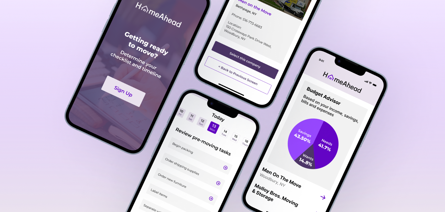
Moving combines logistical planning, financial decisions, and emotional transition. Yet the resources people rely on are scattered across apps, websites, spreadsheets, and informal advice.
How might we make the moving process feel more organized, predictable, and manageable?
Research
I conducted qualitative interviews with friends and coworkers to understand how people plan and manage a move.
- Remote interviews via Google Meet
- Detailed note-taking instead of recordings
- Affinity mapping to identify recurring patterns
- Competitive analysis of PODS, U-Haul, and Moving.com
- Remote interviews via Google Meet
- Detailed note-taking instead of recordings
- Affinity mapping to identify recurring patterns
- Competitive analysis of PODS, U-Haul, and Moving.com

What I Learned
Several consistent themes emerged:
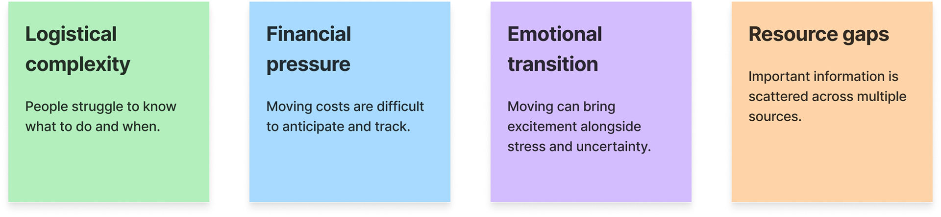
The biggest opportunity wasn't providing more information. It was helping people understand what matters now, what comes next, and where to find trustworthy resources.
From Insight to Product Direction
This led to a core product principle:
People preparing for a move need a clear, resource-backed timeline to reduce uncertainty and prevent missed steps.
I translated this into four design priorities:
- Phase-based guidance across pre-move, moving day, and post-move
- Actionable tasks connected to relevant resources
- Trustworthy information from reliable sources
- Progressive disclosure to reduce cognitive overload
- Phase-based guidance across pre-move, moving day, and post-move
- Actionable tasks connected to relevant resources
- Trustworthy information from reliable sources
- Progressive disclosure to reduce cognitive overload
Designing the Experience
I focused on two core flows: Budgeting and Moving Timeline.
Budget Calculator
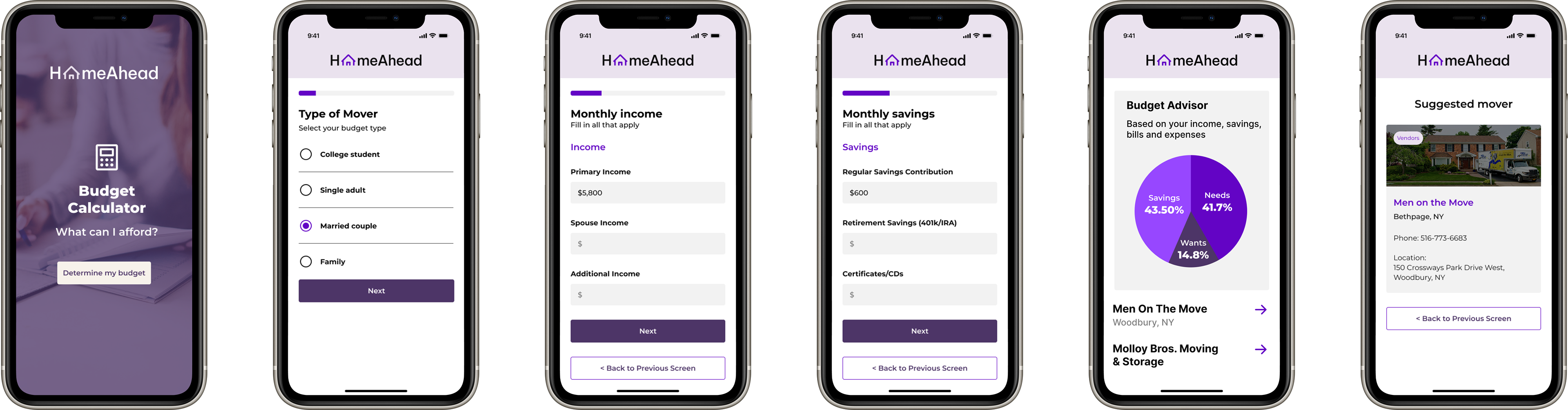
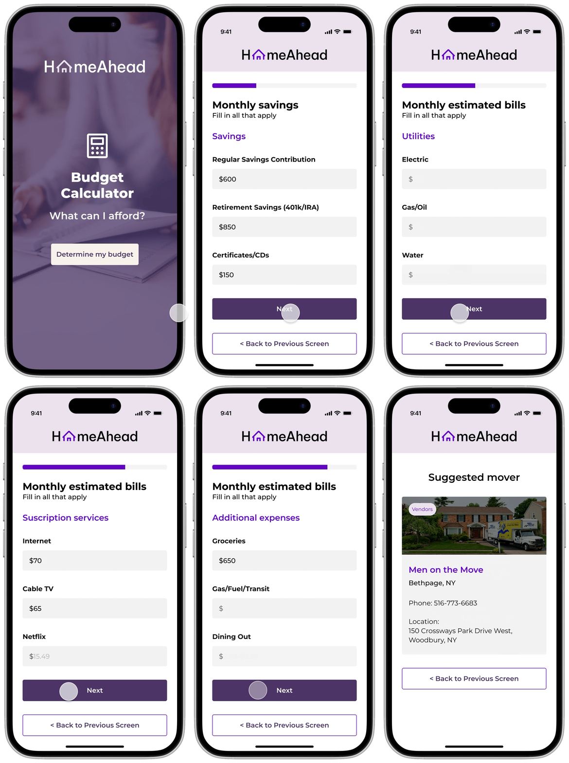
Budgeting was identified as a high-cognitive-load task, so I designed the experience as a series of focused steps rather than one long form.
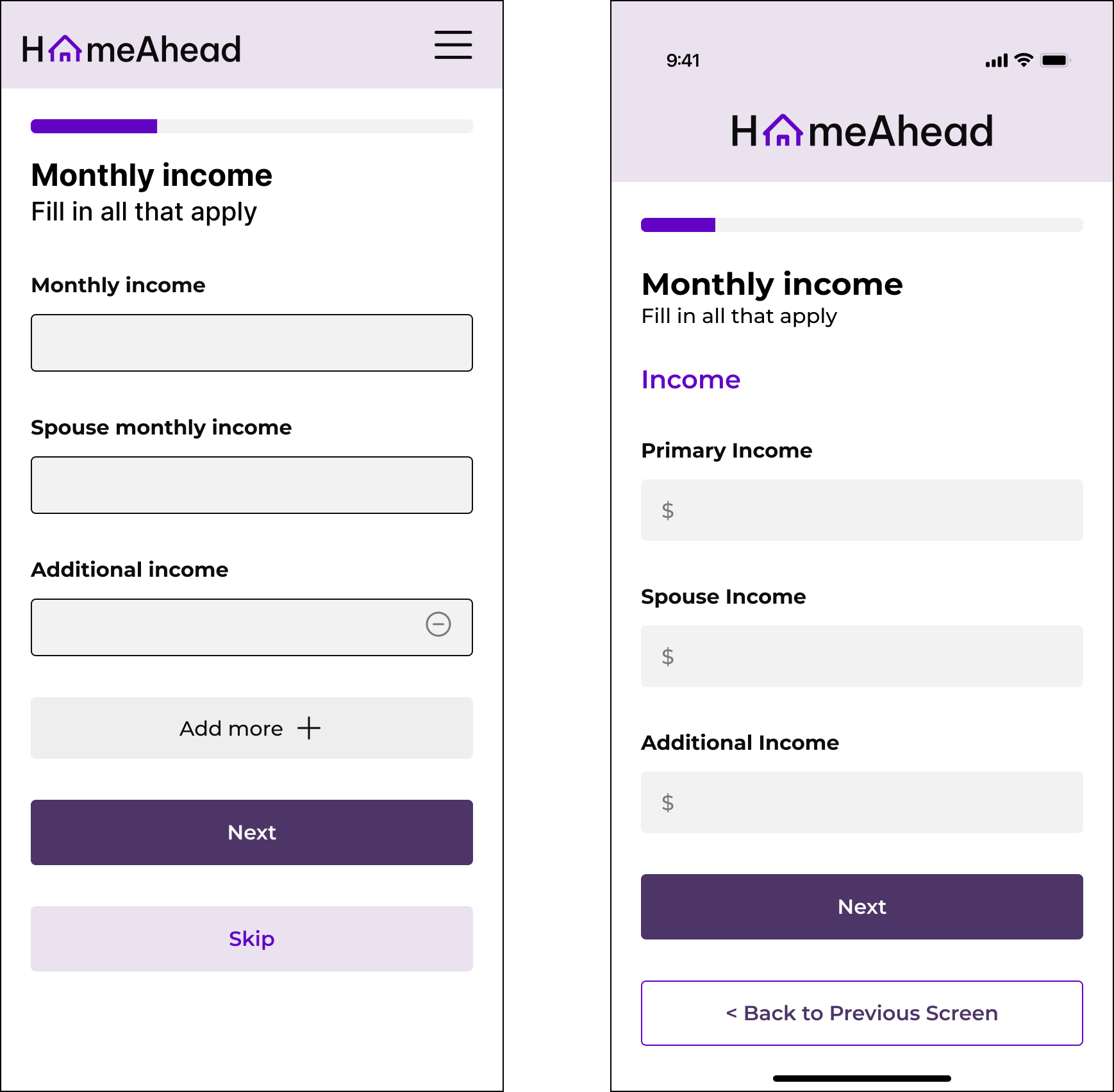
Early wireframes revealed how many financial variables users needed to consider, reinforcing the need for a guided flow.
In high fidelity, I added a progress indicator to improve orientation. I also removed flexible “Add More” and skip options after recognizing that they introduced complexity and could result in incomplete information.
Early wireframes revealed how many financial variables users needed to consider, reinforcing the need for a guided flow.
In high fidelity, I added a progress indicator to improve orientation. I also removed flexible “Add More” and skip options after recognizing that they introduced complexity and could result in incomplete information.
Result: A simpler, more guided budgeting experience designed to produce more complete estimates.
Moving Timeline
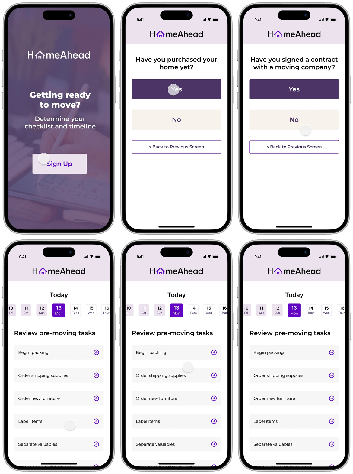
The timeline organizes time-sensitive tasks around where users are in the moving process.
I introduced a countdown and phase-based checklist to help users prioritize upcoming actions. The experience also branches based on whether someone is moving into a rental or purchased home, allowing recommendations and tasks to remain relevant to their situation.
Result: A personalized, easier-to-scan roadmap that helps users focus on what needs to happen next.

Iteration & Usability Testing
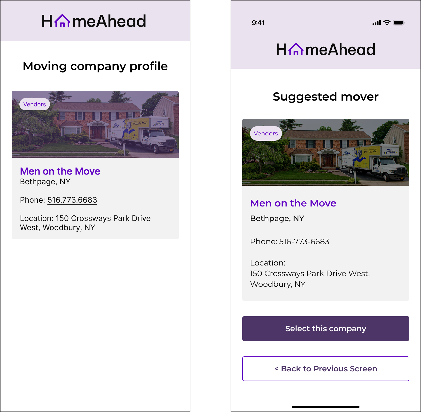
Usability testing revealed confusion around transitions and next steps, particularly for first-time movers.
I responded by refining navigation, adding clearer guidance and supporting screens, and strengthening visual cues throughout the experience.
These iterations improved comprehension and made the core flows feel more confident and guided.
I responded by refining navigation, adding clearer guidance and supporting screens, and strengthening visual cues throughout the experience.
These iterations improved comprehension and made the core flows feel more confident and guided.
Visual Direction
The visual system was designed around the emotional needs uncovered during research: calm, trust, and organization.
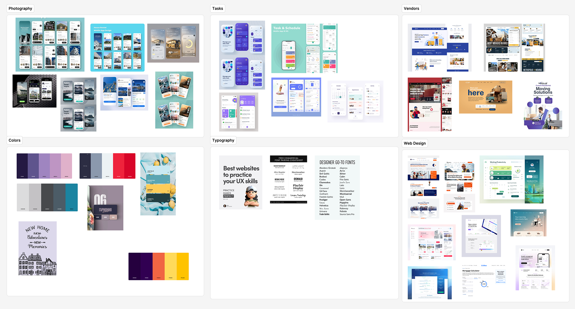
Mood boards explored different visual directions before establishing the final color palette, typography, and component system.
Mood boards explored different visual directions before establishing the final color palette, typography, and component system.

Final UI
Budget Calculator
Timeline
Reflection
HomeAhead reinforced an important design lesson: users don't always need more information—they need better guidance.
The research directly shaped the product strategy, from the phase-based timeline to the simplified budget calculator.
Working with a small, unrecorded interview sample also highlighted an opportunity for deeper validation. Given more time, I would conduct additional usability testing and explore personalization based on move type, location, and individual circumstances.
The research directly shaped the product strategy, from the phase-based timeline to the simplified budget calculator.
Working with a small, unrecorded interview sample also highlighted an opportunity for deeper validation. Given more time, I would conduct additional usability testing and explore personalization based on move type, location, and individual circumstances.
HomeAhead strengthened my ability to turn qualitative research into focused product decisions—and to use iteration to make complex experiences feel simpler.